U.S. Bank
Design System
The Need
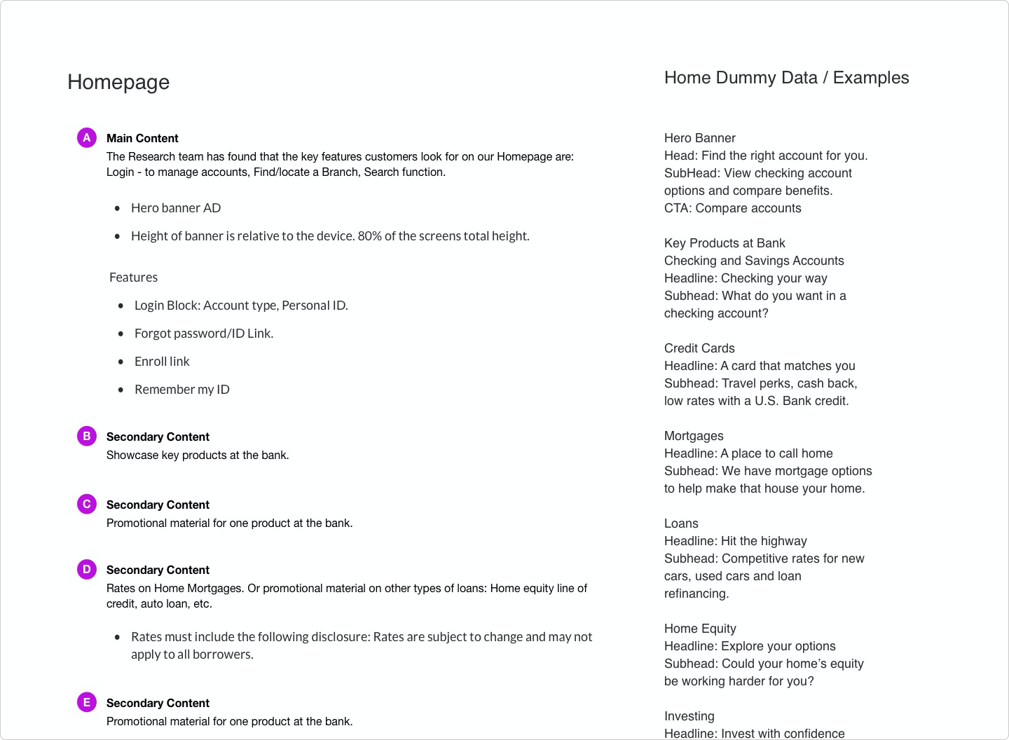
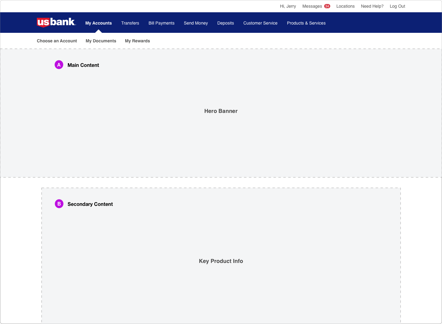
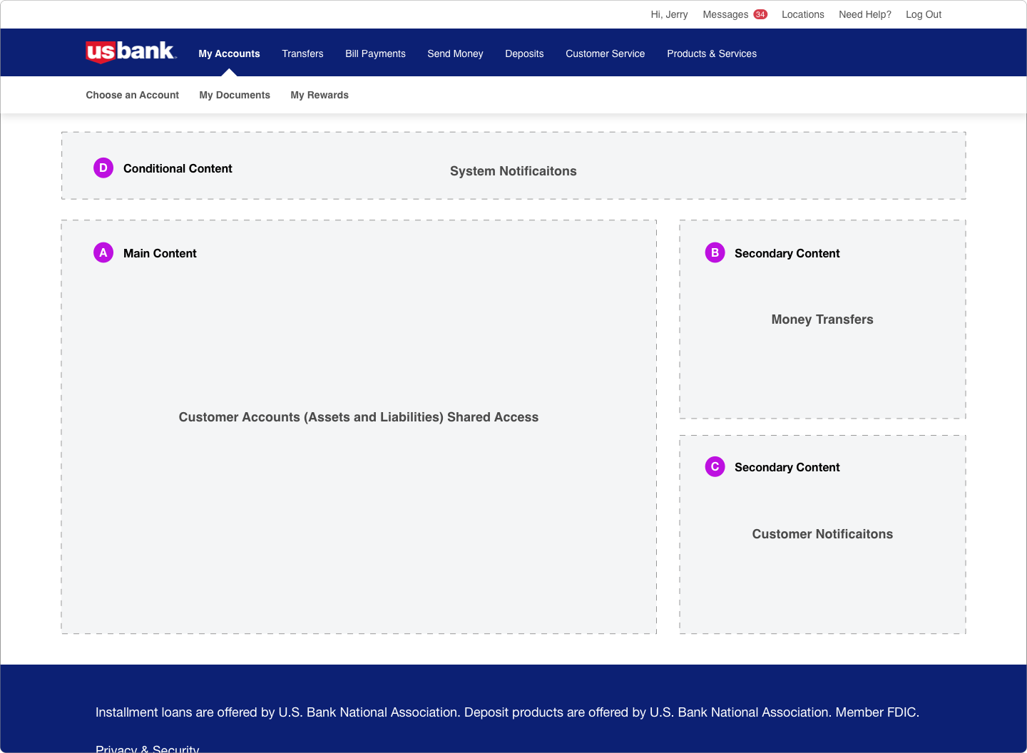
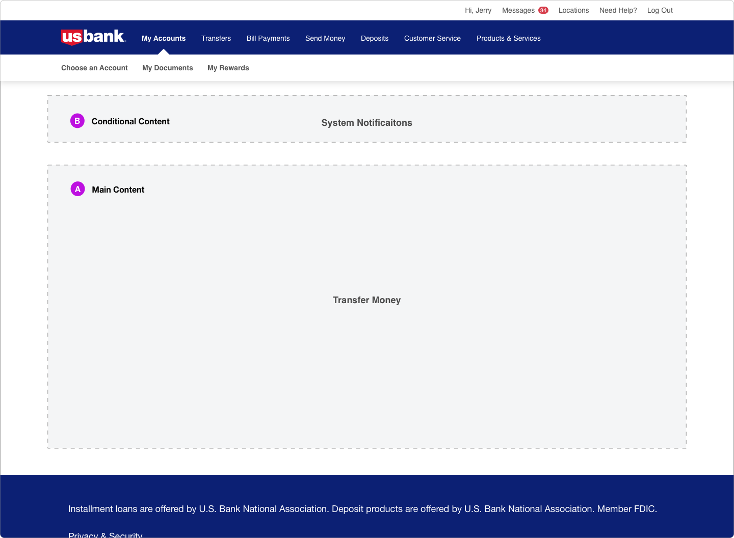
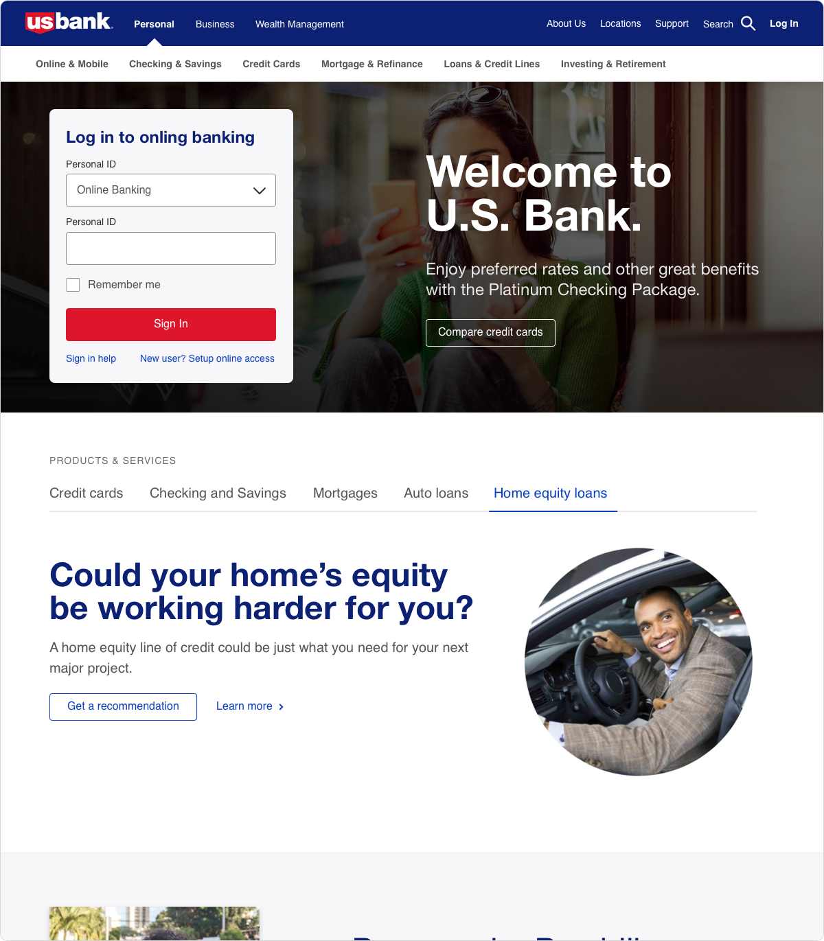
USBank.com had issues with a disjointed design system and a lack of consistency between digital experiences. The biggest flaw in our previous system was a lack of flexibility and definition.
The TaskI worked with another designer to create the building blocks of our most common components, write documentation, test components and develop a sketch pattern library. We were given a total of 4 months.
Research
The Preliminary
Design Systems are as much about teams and people as they are about components and patterns. I spent as much time as possible studying other design systems, competitor apps and researching how to build and evangelize a Design System. Early buy in from the extended teams was critical to achieve participation in consistent use of the library.
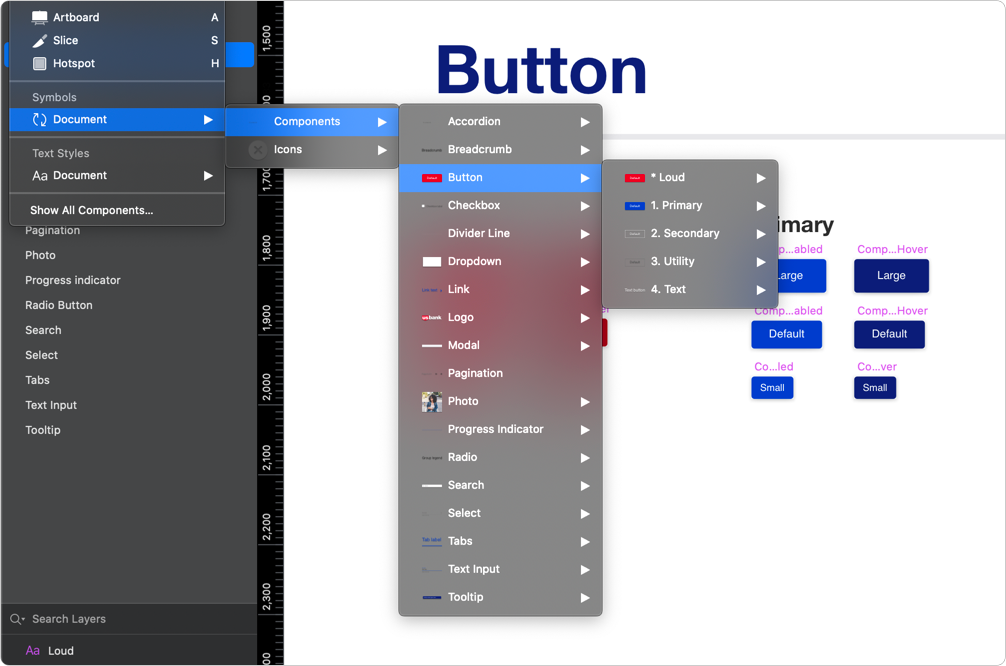
Building the Library
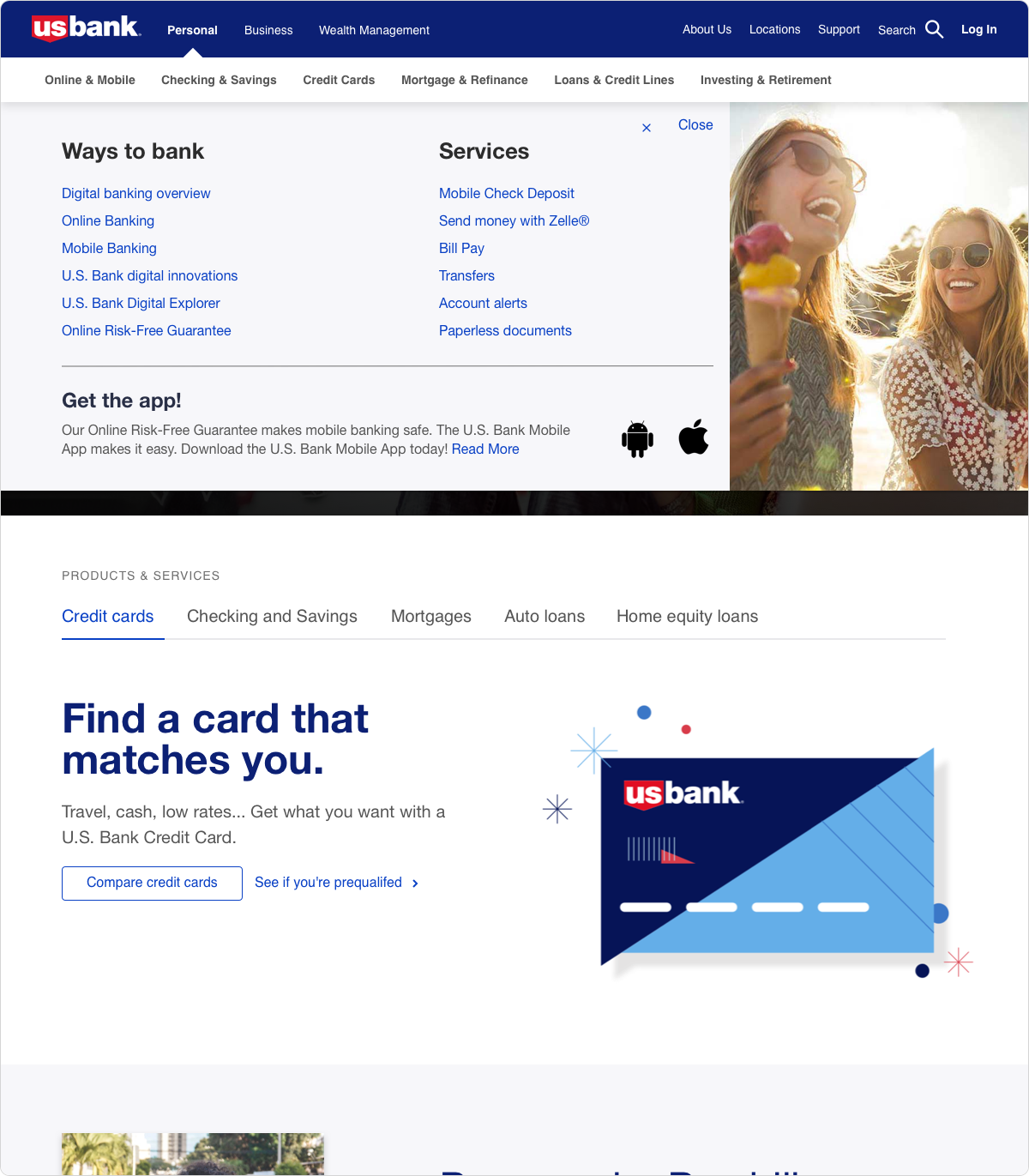
Sketch
We built flexible Sketch components to be as simple and intuitive as possible. The design of the components were subtly informed by the existing mobile patterns with optimization for the web. Eventually it would ingest the mobile platforms to create one cohesive set of patterns.
Accessibility was essential due to how universal banking is as a service. We partnered with developers, researchers and accessibility experts to hear concerns and possible enhancements. Our main goal was to produce a tool that would assist our customers both outside and within the bank.
Testing
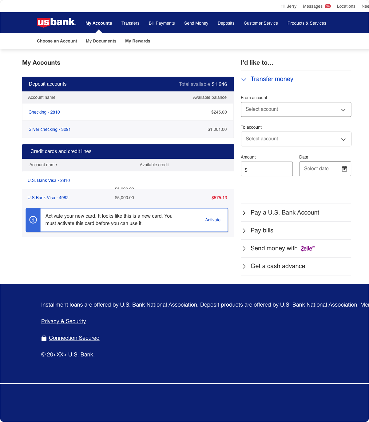
Internal Users
Focus groups periodically tested our system to give feedback. I built design challenges with requirements, suggested content and wireframes to stress test our work and identify areas of confusion for the extended UX team. Team members had to follow the feature requirements and loosely follow the wireframes. Any additional improvements would be welcome. The feedback was overall positive, team members identified an increase in flexibility and clearer component definition as key strengths.
Testing
External Users
I was the primary advocate for usability testing within the design system team. I organized, built wireframes and worked directly with our usability researchers to test our components before they were disseminated to the greater UX team. I built prototypes showcasing customer facing, internal and marketing experiences to test with various kinds of users. Components with usability issues were identified and adjusted based on the recommendation from our accessibility and research teams.
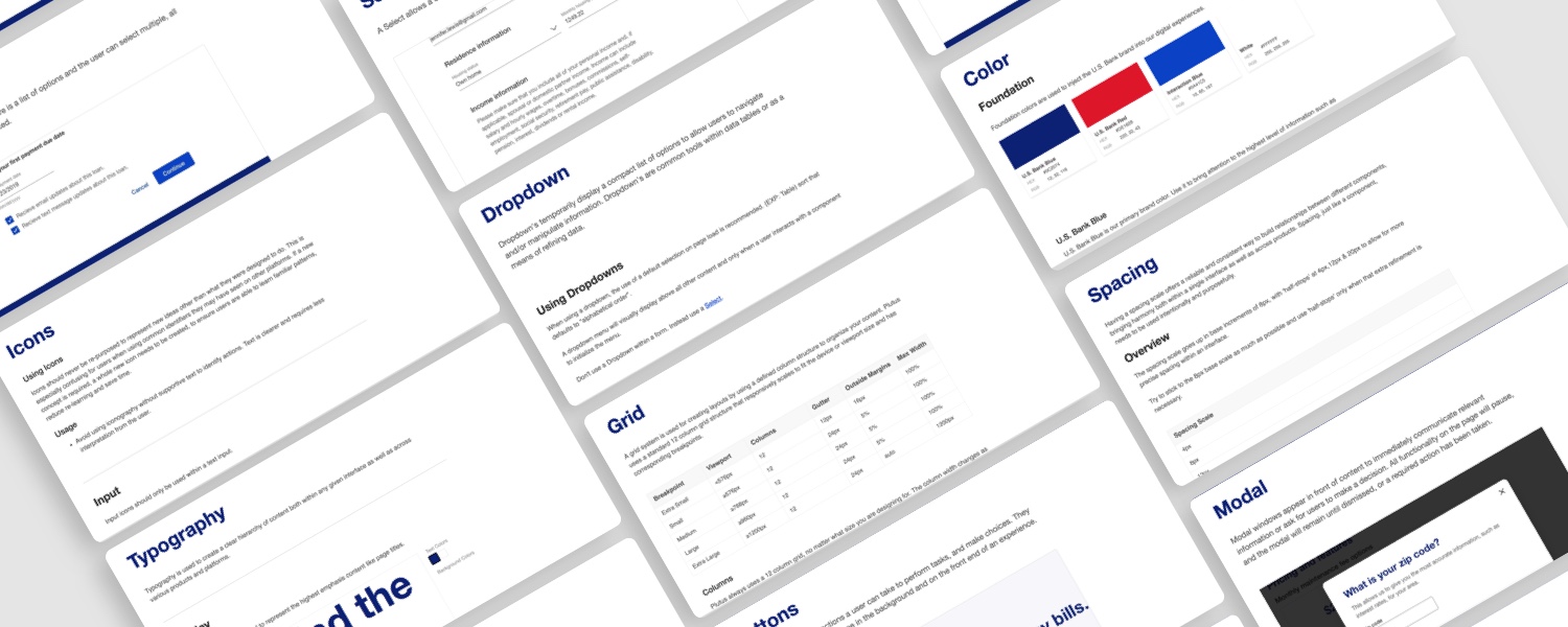
Document
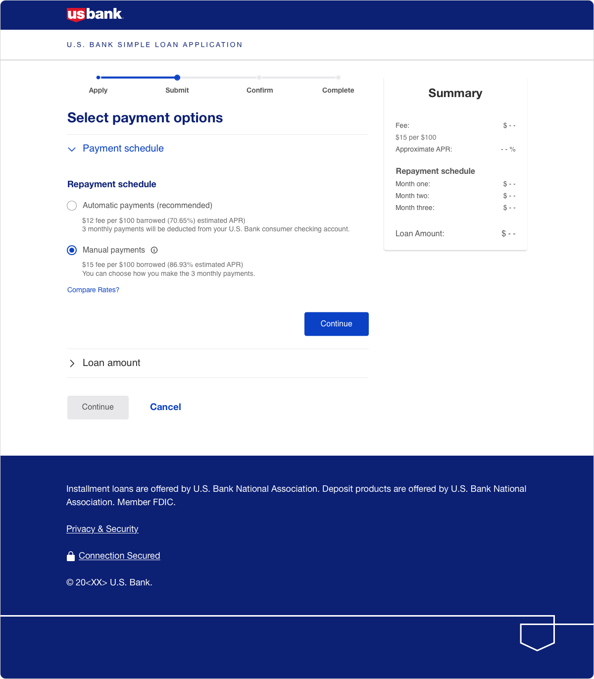
Finalize
Once our patterns were finalized and approved we started to document each component in a website. The documentation included a detailed definition, best practices, measurements, stylization and accessibility recommendations. The system was gradually rolled out to different UX teams and the mobile platform and I began to evangelize best practices.
"During his time at U.S. Bank, Michael supported the efforts of a few of my teams. While supporting these efforts, Michael showcased an incredible attention to detail and advocacy for collaboration. His design recommendations always kept the end user in mind and his justification was always rooted in factual data. He can wear multiple hats as well as manage a wide variety of projects. His work on U.S. Bank's Design System has been instrumental to the enterprise's overall success and has been leveraged by numerous teams. Michael will be an asset to whatever team he lands on and I look forward to seeing where his career takes him."
Nathan D.
Associate Design Director